November 21st, 2022
Hi friends of Glean!
We’ve had an exciting couple of weeks at our NYC office; wrapping up a productive cycle and finishing it off with Glean’s Maker Week. Maker Week lets us set aside some time to work on riskier experiments and generally hack around on product ideas.
We made enough progress during the week to get a couple new projects on the roadmap 🚀! You can see these projects in our new public version of our product roadmap. Hit us up on Slack or email me directly if you have any feedback.
Now for some highlights from the last month:
- Custom Color Palettes
- Improved filtering and breaking out interactions
- Project invite links
- Resource history
- Other improvements and fixes: negative values in stacked charts, partner projects, explorer embeds, improved DataOps builds
Custom Color Palettes
Use custom palettes in your charts!
}
You can now add customized color palettes to your project and use them in any chart. Head over to the settings page (opens in a new tab) to add new palettes or use DataOps to configure palettes with code. Use a custom color palette for a specific exploration to tell a more effective data story - like using green for increases and red for decreases in revenue.
You can also override Glean’s default color palette to make your project feel tailored to your organization. Your default palette will automatically be applied to every chart in your project that doesn’t have different custom colors configured.
Automatically add teammates with Invite Links
You can generate a secret invite link through your settings page that allows your teammates to join your project automatically. You can now avoid having to manually add the email address of each teammate individually, which was painful for large projects.
Resource History
You can now see the change history for dashboards, saved explorations and data models in Glean. Who updated this saved exploration and when? Did this saved exploration get updated with a DataOps build? At the top of the Explorer, click on the carat next to a resource to see the resource’s history.
Improved attribute filtering and breaking out
We did a big push on improving the UX of breaking out and filtering from the attribute tray. Now it’s easier to compare items in an attribute: say customer A versus customer B while excluding other customers. Breaking out an attribute now pulls up a drawer where you can configure a breakout separately from a filter. You can now rearrange items and filter out items in your breakout much more easily.
Other improvements and fixes:
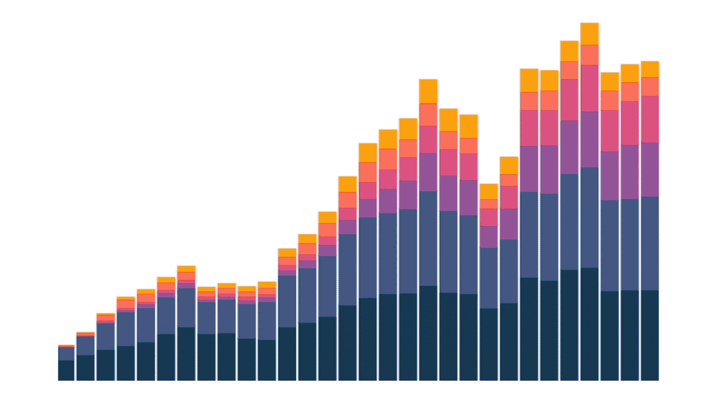
- Allow negative values in stacked bar charts - Negative stacking can be helpful for showing positive and negative contributions to a total, like revenue.
- Invite customers into shared Partner Projects - Create a separate Partner Project to safely share data with external partners without inviting them into your main project. Reach out to us to enable this feature.
- Explorer embed beta - We now have a version of our data explorer that can be embedded into other applications. Ask us about joining the beta!
- Improved DataOps builds with other tools like dbt - We now do a fast check on yml and json files to make sure they are a Glean type before trying to parse them. This allows you to more easily trigger DataOps builds when there are other types of configuration files in the same folder.
What’s next? Check out our public roadmap
Check out our product roadmap to see what’s on the horizon, let us know if you have any feedback or if we’re missing anything! We’re starting to research a deep slack integration, let us know if you’d like to be a beta tester!