Metrics
Drag the number icon from the toolbar onto your dashboard to add a new metric to the dashboard. Hover over the metric and click the cog icon to edit it. Want to dig deeper into your data? Click on any metric tile when in view mode to see your metric in Explore.
Text labels
Heading: The label shown under the value of this metric.
Data settings
Metrics can be calculated as either Simple Metrics or Relative Comparison metrics. Simple Metrics calculate a value across all data in a filtered range whereas Relative Comparison metrics calculate a value over specific periods of data so you can see a metric value for the last week, month, etc.
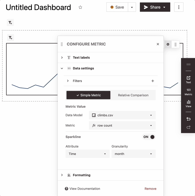
Simple metrics
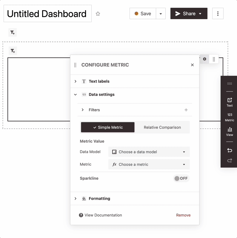
Metric Value: Choose a data model and metric to display.
Sparkline: Click the toggle to enable or disable a sparkline visualization of your metric. Select a date and granularity to go on the x axis of the sparkline. Although less commonly used, it's also possible to choose a number for the x axis.
Relative metrics
Calculating Relative Metrics - Relative metrics display a metric value calculated over periods of data (specified as a granularity or range of numbers). As new data comes in this value will change to reflect the last period in your dataset.
Metric Value: Choose a data model and metric to display. Then select the date or number that you want to aggregate the metric over and adjust the granularity or bin size to see values over the most recent week, month, etc of your dataset.
Sparkline: Click the toggle to enable or disable a sparkline visualization of your metric. Values will be plotted over the date or number you've selected to calculate the metric.
Comparison Text: When comparisons are enabled the tile will display the difference between the value for the most recent period and the prior period in your data. For example, if you have your relative metric set to show user count over a month enabling this feature will show you the difference between users the last month of data and the prior month.
Filters
Adding Filters: Click the + icon in the "Filters" section to add filters to your metric. These filters will only apply to this metric, and will not be editable by viewers.
Updating Filters: Click on individual filter chips in the "Filters" section to edit or delete filters that exist on a metric.
Ignore Dashboard Filters: Check this box if you want this metric to ignore dashboard filters. When this is set, only the filters specified on the metric will be used.
Formatting
Up/Down Colors: If the metric is a Relative Comparison metric with comparison text enabled you'll be able to customize how negative and positive differences are displayed. Simply click into a color and change the values to a new color code. Positive differences will be displayed in the Up color and negative differences will be displayed in the Down color.