Chart Interactions
Glean charts are designed to be interactive and allow you to dig deeper with simple chart interactions. Clicking any item in a chart allows you to filter and hovering reveals the underlying chart data.
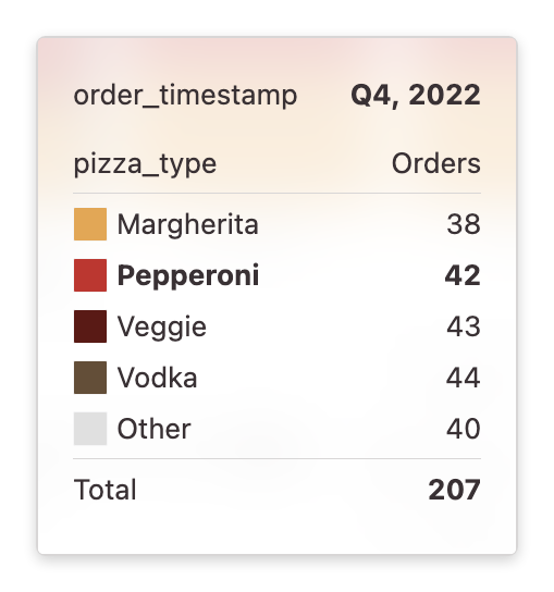
Hover to reveal data
Hovering over items in the main chart allows you to see the value of the data that the item represents. If you are using a proportional stacked chart, this data will include the percentage of this item as well.
Drag to filter a range
If you click any Cartesian plot (eg. a Bar, Area or Line chart) you can drag to filter down to a range of data. This works for both timeseries charts (with a date as the X axis) and charts with numeric X axis.

Dragging to filter will always use the grouping of the x column. For example, if the data is grouped by week, then the filter will always be on a week cutoff. If the data is binned by numeric values, the data filter will be defined on bin boundaries.
Click to filter an item
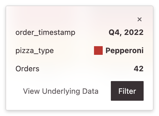
Clicking any item in a Cartesian chart allows you to filter the entire exploration to the data contained just in that item.
For example, if you click a broken out chart, filtering the item will filter for both the time period of the item as well as the value of the breakout in that item. The below example would filter to both the week of August 16th as well as to just the complaint_type of Noise - Residential.
Exploring further from the tooltip
You can also easily explore other models with the data in that item:
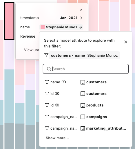
Choose another model attribute to explore that model with a filter created from the item's data. You can choose any attribute with the same type from any model in your project.