June 30th, 2023
Hello friends of Glean -
Happy Summer! Thanks to all of the NYC folks who came out to our happy hour. As we wrap up the first half of the year, we’re excited that some major infrastructure improvements are translating to long-awaited features in our charting library!
As always, check out our public roadmap (on our new docs site!) for some exciting analytics and collaboration features we have coming up over the rest of the summer. Have a great holiday weekend and we’ll see you in a month!
- Carlos
Bar + Line Charts… and more!
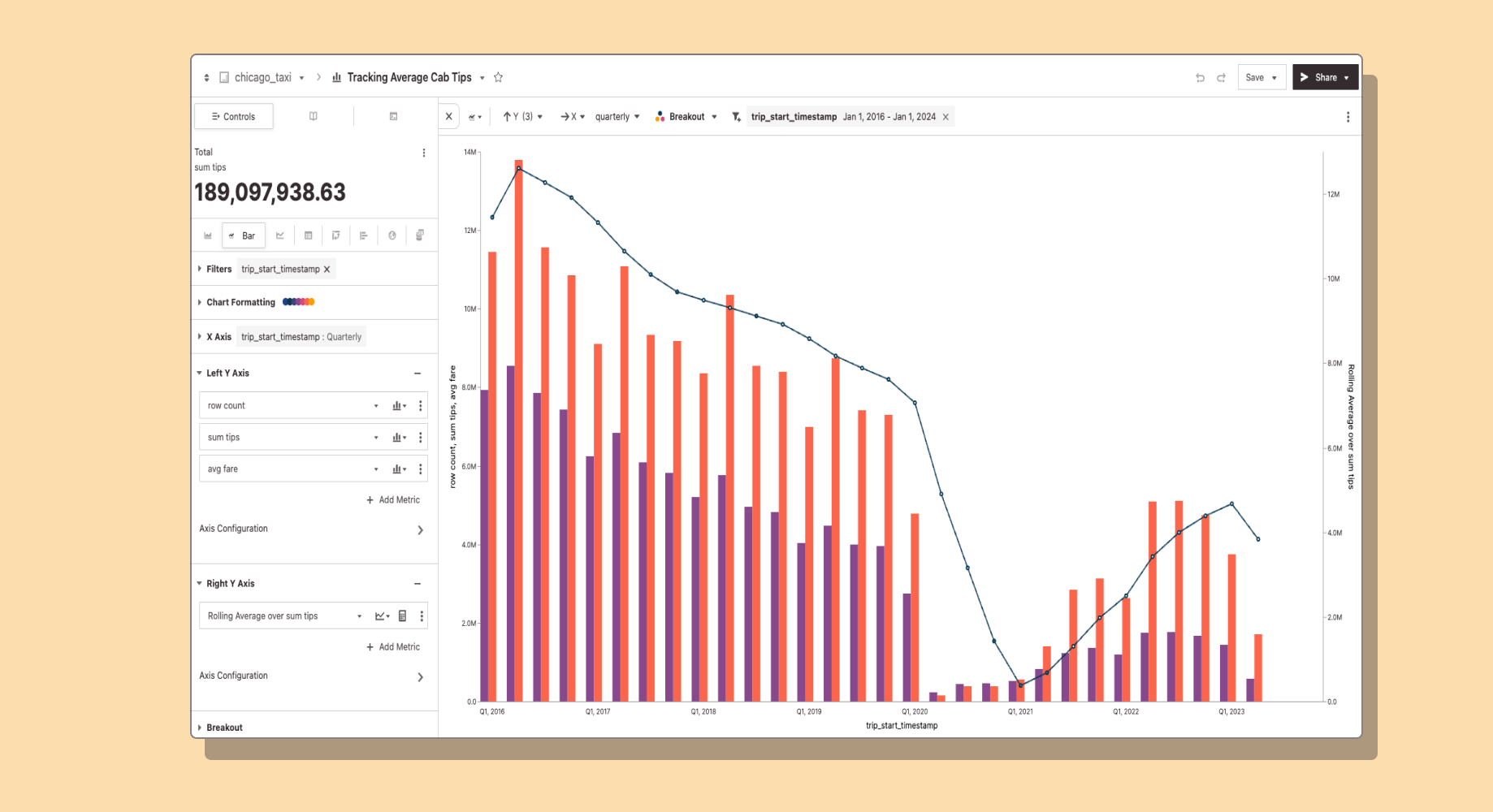
You’re now able to configure different mark types for each metric in Glean! Choose from bars, areas, and lines to layer on top of each other in the same chart. Mixing mark types can help easily visually distinguish different types of metrics. For example, you can use bars for metrics that represent quantities, and lines on the same chart to show trends over time.
There’s more! You can also display metrics on different axes and scales. With this feature, you can easily compare different metrics by adding a secondary y-axis into your views. This is particularly valuable when dealing with datasets that have significantly different ranges or units of measurement.
You can customize each y-axis by adjusting their scales and ranges individually in the lefthand Control Panel. Combine these two features for highly customized, powerful charts.
Documentation Synced from dbt and your Warehouse
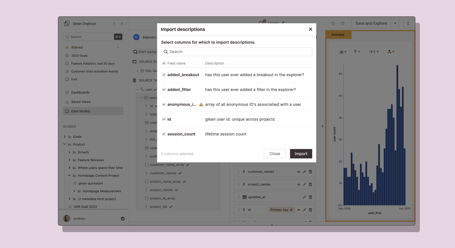
Description syncing is going to make your life so much easier! If you’ve already written your docs in dbt or directly in Snowflake or Redshift, we’ll take care of the rest.
Glean will automatically import those descriptions when you create a Data Model or add new Attributes to it. You’ll always be able to keep your descriptions up to date with the Import Descriptions feature when the descriptions in your table change. Start syncing today!
Filter and Group Array Values
Say hello to array attributes! Glean now natively handles analyzing array types from a model. You can filter and group array elements while preserving your original metrics, attributes and calculations.
Let’s say you have a Glean model for marketing campaigns. Each campaign has multiple ‘tags’ that you wanted to analyze: (eg. ‘drip campaign 2’ and ‘enterprise customer’). Previously you’d have to create a new model to analyze the tags instead of being able to analyze them with your original campaigns model. Array attributes let you analyze all your campaign metrics consistently across the multiple tags. So you can view performance for your ‘enterprise customers’ compared to your ‘drip campaign 2,’ even though they are overlapping.
Improved DataOps Workflow with Glean Pull
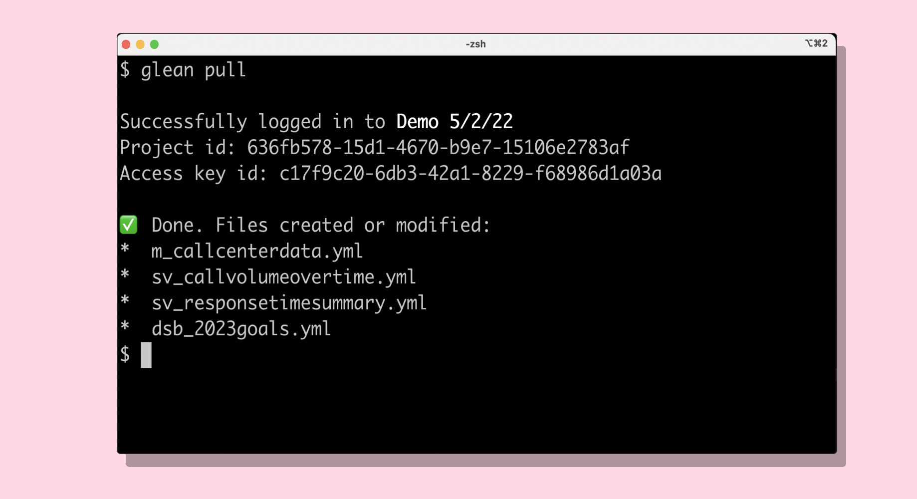
Our team is continuing to invest in DataOps so you can easily manage all of your Glean resources in code.
The latest release, Glean Pull, is a command-line utility to create and update DataOps configs from web-based resources. Use the Glean web interface to collaboratively improve your data models and visualizations, then use Glean Pull to keep your DataOps synced.
📚 Other Updates, Blog Posts & More
- ClickHouse + Glean - Our latest integration has arrived! Glean now supports Clickhouse as a data source, check out the details and get set up today.
- Happy Pride! - Check out our custom 🌈 palette and explore a visualization of the progress made across the world in countries officially recognizing pride events here. (opens in a new tab)
- SQL Editor Improvements - You can now run a partial highlighted query from the SQL editor by highlighting and cmd + enter!
👀 Hoping to see something else on our feature release list? Check out our Product Roadmap and let us know what we’re missing.
You can drop us a note or ping us on Slack with your💡ideas, 🗣 feedback, or 🙋questions. We look forward to👂hearing from you!